Blocks form the fundamental framework for a web page’s content. They enable the addition of various content types and simplify the organization of content on your page.
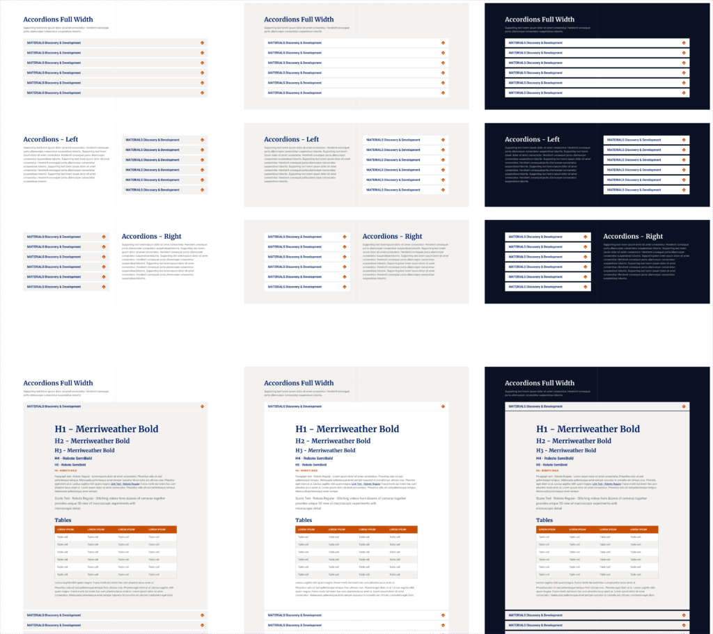
Accordion
The accordion block condenses extensive content into a compact, easily scannable list. Each row of the accordion can expand to reveal a text block, offering great flexibility in content presentation.
Call to Action
The Call-to-Action (CTA) block serves as a standout content piece, designed to interrupt the page flow and deliver a specific call-to-action.

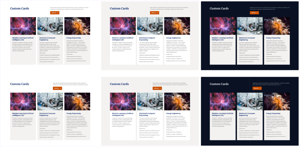
Custom Cards
The custom card block lets you arrange content in a trio, similar to News or Event Feeders, but with complete control over the contents of each card. You can choose to include an image, title, and description for each card, all of which are optional. The height of the cards is based on the tallest one, with others stretching to match. Adding a link to a card turns the title into an underlined, clickable feature. Additionally, this block includes optional elements like a Heading, a Description, and a button.
Departments with Feature
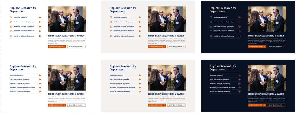
This block combines a list of links with a call-to-action feature.
Divider
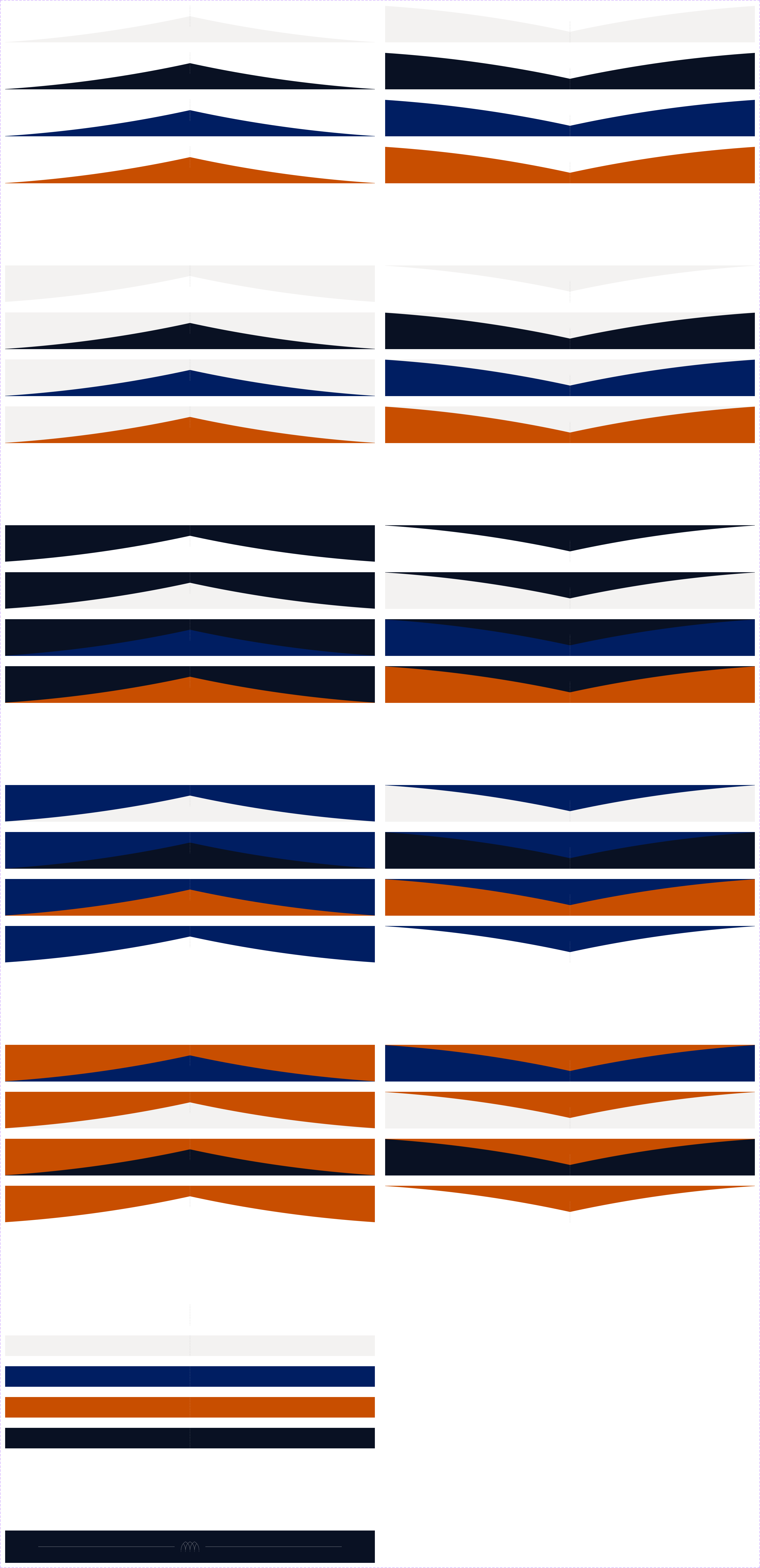
Dividers are utilized to soften the appearance of stark horizontal lines between blocks, subtly encouraging vertical scrolling. Our site primarily uses three background colors: White, Whisper Gray, and Midnight. The divider block is designed to seamlessly integrate with any combination of these colors.
Events Feeder
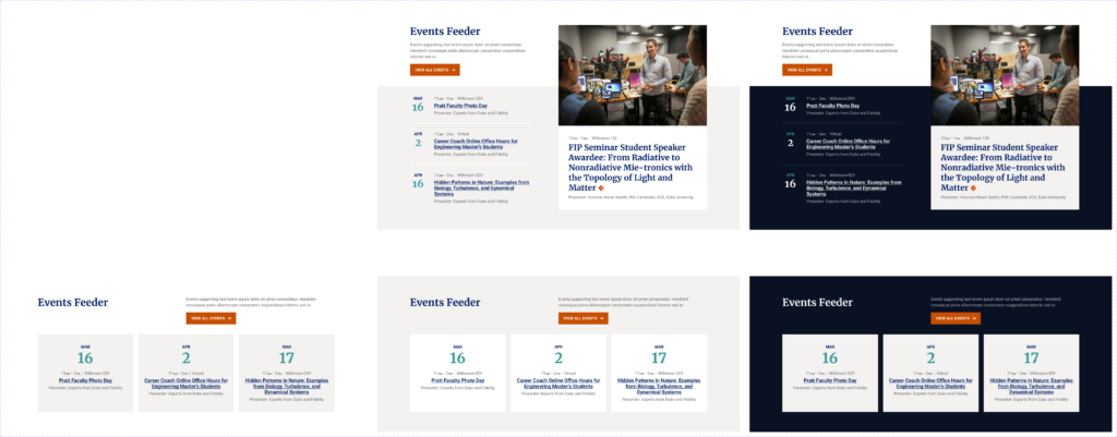
The events feeder displays the three nearest upcoming events. In the Feature layout, you can select a specific event to highlight from a list and manually upload an image for it.
Faculty Feeder
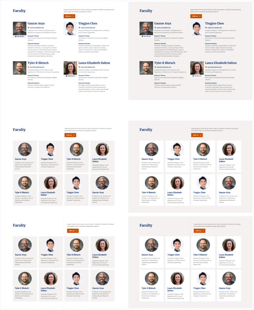
The faculty feeder block is designed to showcase individuals on our pages. You can include any number of people in this block. In rows with fewer than four people, the cards will align to the left, leaving empty spaces on the right. This block also offers optional features like a Heading, a Description, and a button.
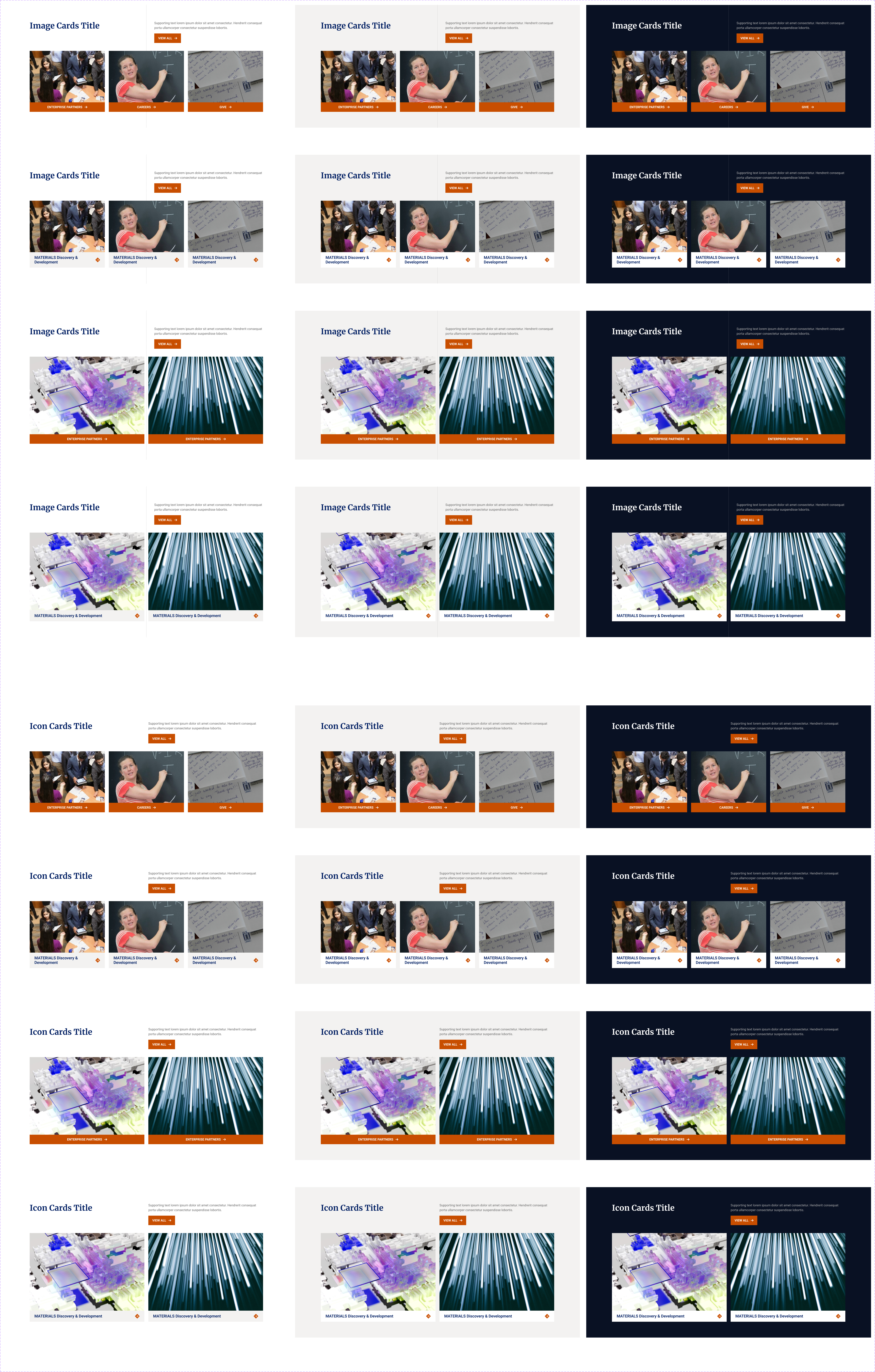
Icon Cards
Icon cards offer a method to showcase departments, themes, or similar content categories without the need for photos. You can add multiple rows to this block, but each row must have the same number of cards. An arrow icon appears next to the title of each card only if a link is attached to it. The block features optional elements including a Heading, a Description, and a button. Icons available to use from Font Awesome are listed here.
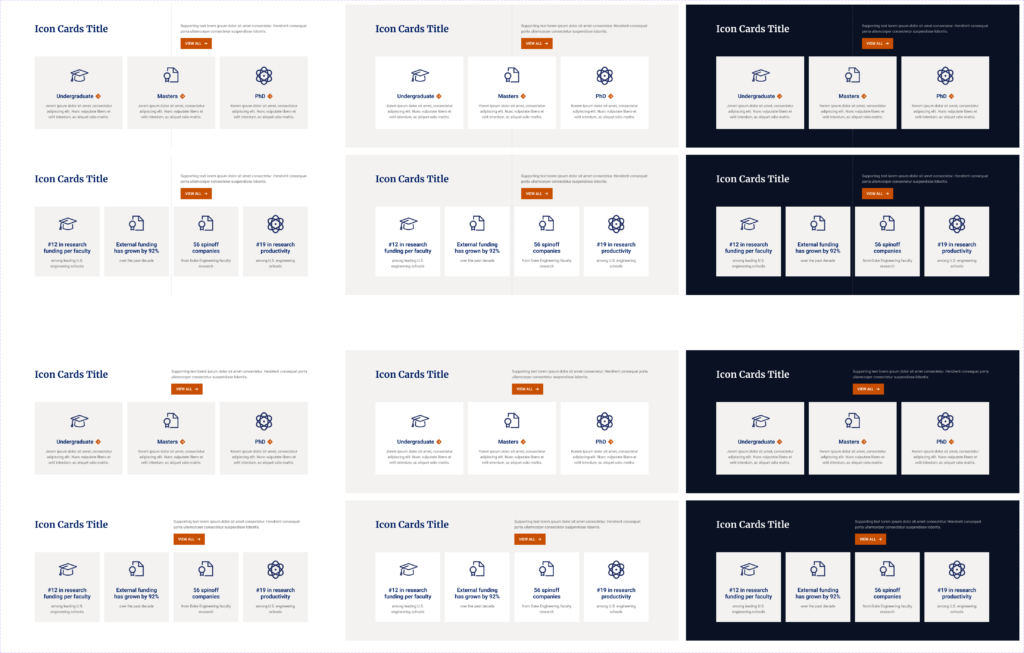
Image Cards
This block is designed to visually guide visitors using images. The image aspect ratio is fixed, with the width adjusting as necessary. You can include multiple rows in this block, but each row must contain the same number of items. The block also includes optional elements such as a Heading, a Description, and a button.
Image, Text, and Button (ITB)
The Image, Text, and Button (ITB) block is crafted to prominently showcase a single content item, using a larger and more visual format. Its purpose is to capture attention and guide users to a specific destination.
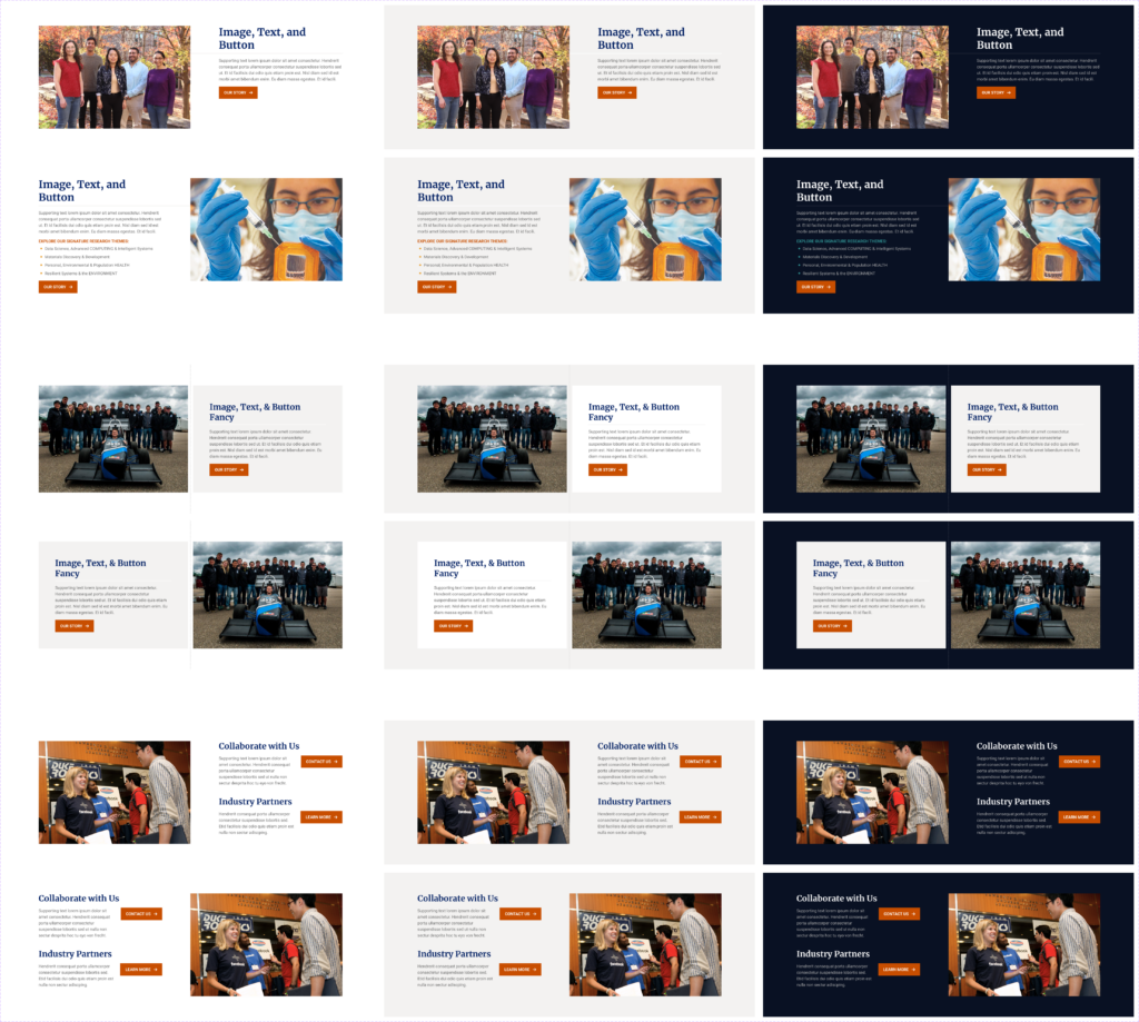
List Image, Text, and Button (List ITB)
The list ITB (Image, Text, Button) block is crafted to display content in a list format, allowing for multiple entries unlike the single-row ITB. It is ideal for presenting items such as major programs. Each row in this block can include optional fields like an image, heading, description, and button. To maintain its informational or utility purpose, the layout and color options for this block are deliberately restricted.

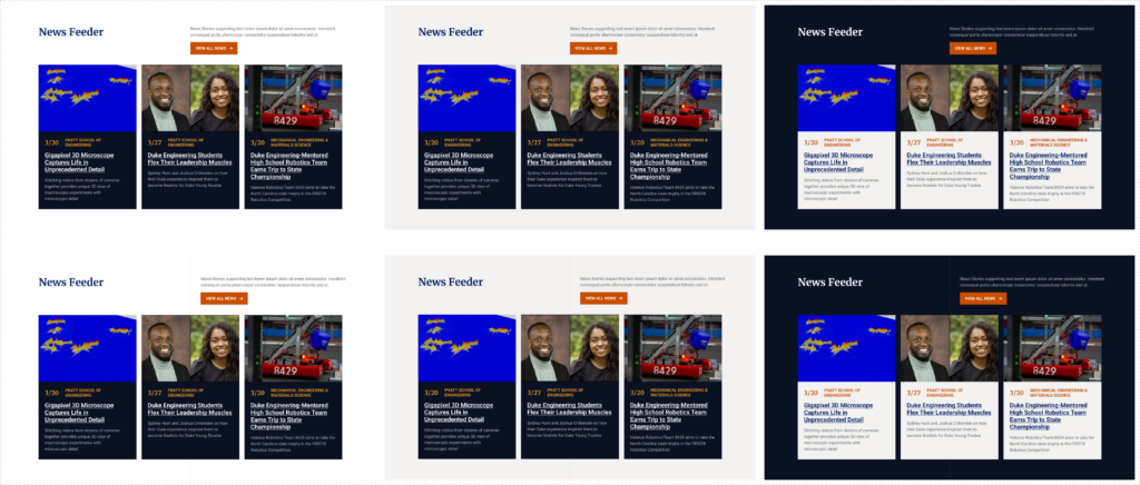
News Feeder
The news feeder automatically displays the three latest news posts from a selected category, formatted as cards. It does not allow for adding extra rows. This block includes optional features such as a Heading, a Description, and a button.
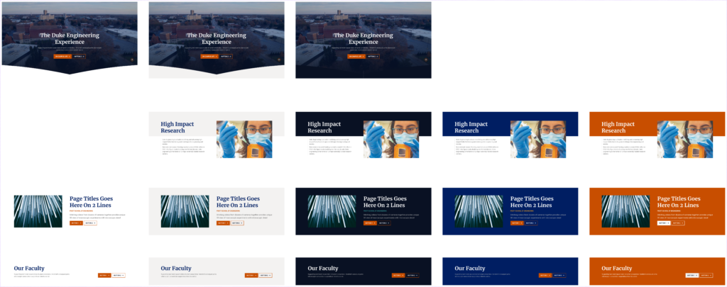
Page Headers
Page headers are limited to pages that allow for various header options at the beginning. They should not be used on news posts or other post types that already have predefined header templates.
Podcast Feeder
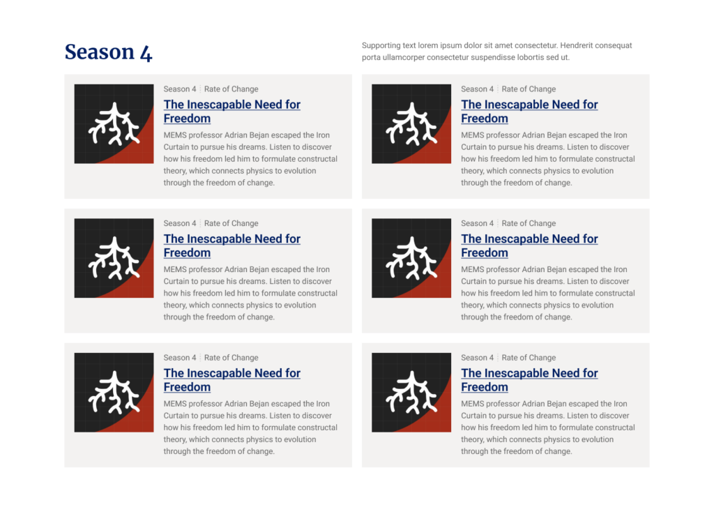
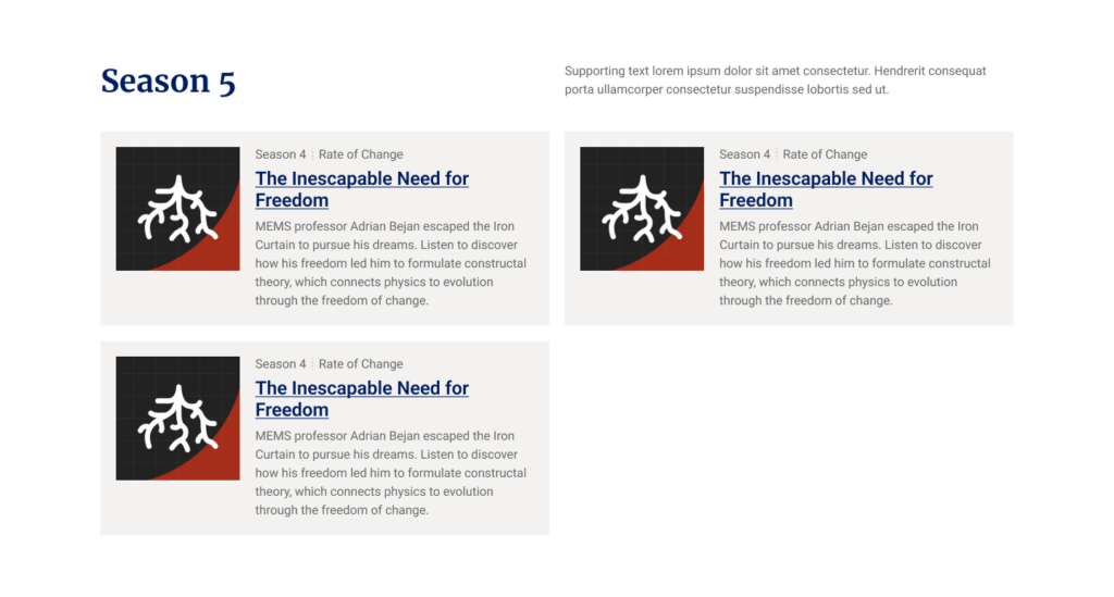
The podcast feeder block is designed to display a series of cards, each linking to a separate podcast page. A typical application is on a Podcast Archive page, where you can use one block instance for each podcast season. This block allows for any number of podcast cards. For rows with an uneven number of cards, they should align to the left. The block also includes optional elements like a Heading, a Description, and a button.

Quote
The quote block enables you to prominently display a quote from any individual. This block offers several optional fields, including an image, the quote text, the attribution title, attribution subtitles, and links to social media pages.

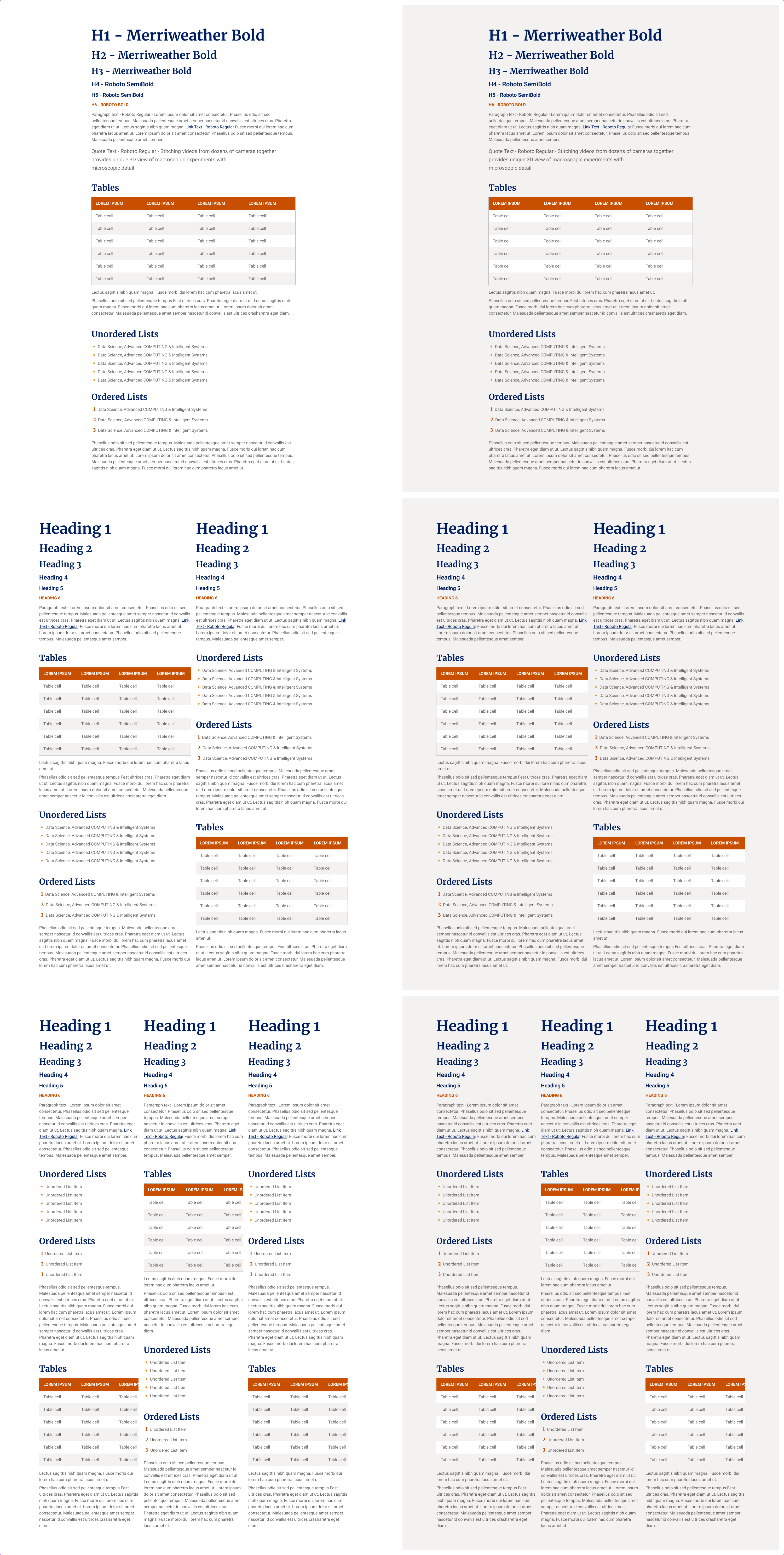
Text
The text block is a versatile tool for your site, handling text input, bulleted lists, and tabular data. Developed from the Gutenberg block editor, it’s a key component for adding content to your site. To enhance readability, we’ve restricted its color options. In mobile view, columns are stacked vertically, with columns on the right displayed below their left counterparts.
